LIGHT
INTENSITY
Intensity
of light can simply be defined as the amount of light being emitted
from a source of light. As you increase a light's intensity from
zero (off)to very high values, interesting things start to happen
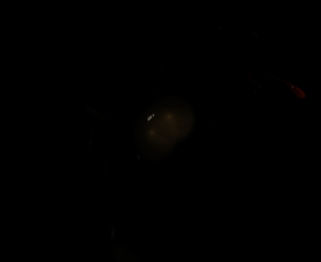
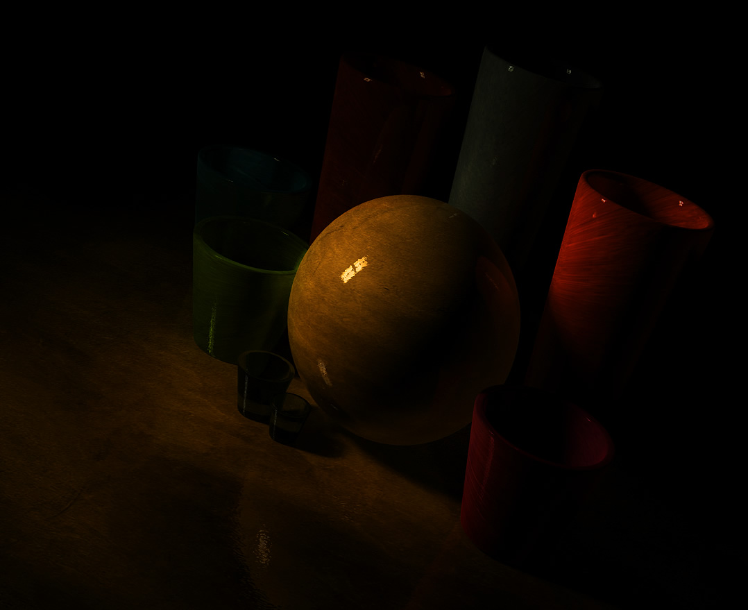
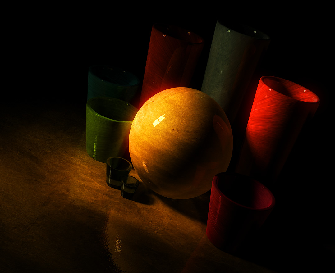
to the objects being lit by such a light. Below is a series of images
that show some of these effects. I wanted to highlight a sphere
placed between some objects, and I analyzed the effects of changing
the intensity of the light in the scene on the overall composition.
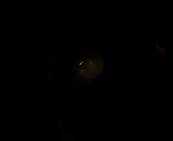
fig. 1.1 |
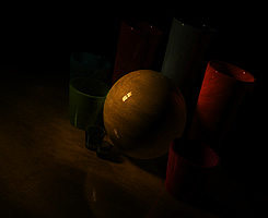
fig. 1.2 |

fig. 1.3 |
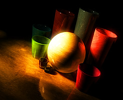
fig. 1.4 |

fig. 1.5 |
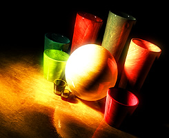
fig. 1.6 |
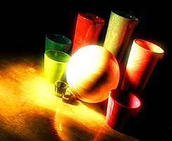
fig. 1.7 |
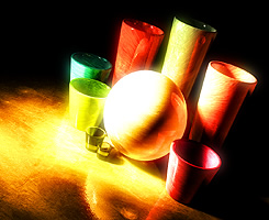
fig. 1.8 |
|
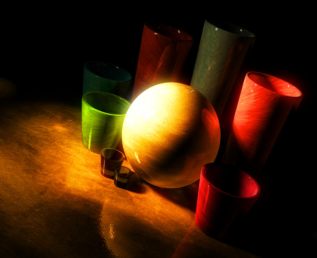
Fig.
1.1 is very under lit and you can barely see the reflection
of the light source.
Fig. 1.2 could still benefit
from a stronger lightsource. A sphere reflecting the light source
is now visible.
Fig. 1.3 shows most of the objects in the scene, but doesn't
make a strong statement. Textures are beginning to emerge.
Fig. 1.4 shows almost
all the objects in the scene. Note that you no longer see the reflection
of the light source, and the texture on a third of the sphere has
been lost.
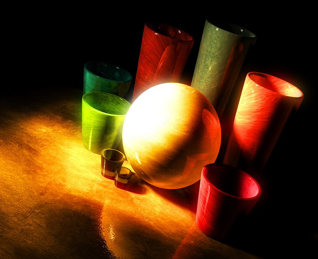
Fig. 1.5 brings out all
the objects in the scene in a clear manner. The sphere's colors
are now over-saturated because of the stronger light (compared to
Fig. 1.3)
Fig. 1.6 shows that the
objects surrounding the central sphere are beginning to get over-exposed
to light, and their colors begin to saturate.
Fig. 1.7 simply intensifies
the effects mentioned in the description of Fig. 1.6.
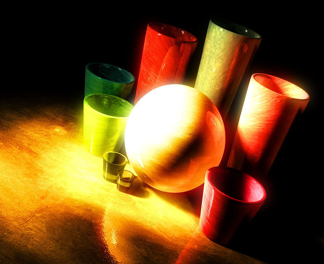
Fig. 1.8 represents wildly
over-saturated colors and overly bright objects with a considerable
amount of texture and foreground lost to over-exposure.
If
we continue to analyze this series of pictures, we'll notice that
the contrast between the sphere and its surrounding objects is very
much balanced in Fig. 1.5 as the surrounding objects are nicely
lit and the profile of the sphere can be clearly recognized. In
Fig. 1.8, however, you'll notice that the sphere no longer has a
central role, leading to weaker composition.
That
being said, there are occasions where over-exposure may be very
desirable. It all depends on how you want to present an image, and
if over-exposure to light brings out some of the subject's stronger
features, then by all means do as you want.
LIGHT
DIRECTION
Imagine
a scene where there's light of equal intensity and color is incident
on a human face from all directions, and the background is black.
What would you see? You would just see the 2-dimensional outline
of the face. Why? Because light rays of the same color and same
intensity will 'paint' all sides of the face with the same color
with the same intensity. If a shadow were to be formed, it would
be washed out instantly by light rays incident upon the shadowed
region.
The
point that I am making here is that the reason we are able to recognize
the shape of an object is because light rays of different intensities
hitting the object from different directions 'paint' the
object with highlights and shadows.
The
direction of incoming light from a light source can enhance the
shape of the subject and the overall emotion in the scene. It can
also ruin what you are trying to capture in the image. To give depth
to the object being lit, place the primary light source, or key
light, at a certain angle to the camera to bring out highlights
and shadows. Doing so will create or enhance the illusion of depth
in your object by having a graduated fall off from bright to dark
over the surface of your object. What you see on the monitor is
actually a two dimensional image, and the illusion of three dimensions
is created by highlights and shadows in your object. To illustrate
this point further, consider the two rendered images below.
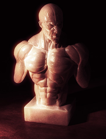
fig. 2.1 |
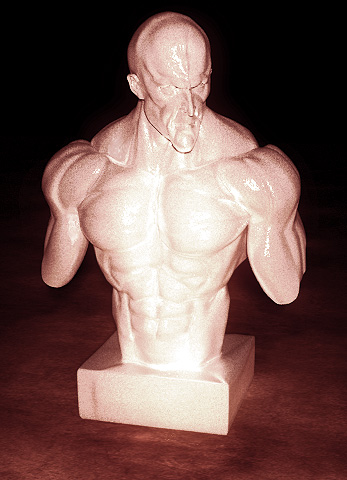
fig. 2.2 |
Fig
2.1 shows the object being lit from a single light source placed
at the left of the camera. You can clearly see the folds, the buldges
and the depressions on the surface. You can also clearly see the
base of this object touching the ground and casting a shadow.
Fig
2.2 represents the same object, but the light source is directly
behind the camera. Frontal details are almost lost because the cast
shadows in 2.1 have been washed out by the direct light. Some detail,
however, on the edges is still visible. It also looks...very boring
in my opinion.
The
direction of incoming light also has an effect on the mood of the
image. Following is a typical example of a face being lit from below,
giving a very dramatic effect. Consider the two images below. Each
shows light coming in from beneath the character's face, but from
different directions and each brings out the personality of the
character in different way. Fig 3.1 directly brings out the menacing
personality of the character, whereas Fig 3.2 brings it out in a
subtle way.
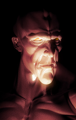
fig. 3.1 |
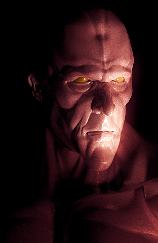
fig. 3.2 |
We are not very
used to seeing such kind of lighting. Outdoors, light comes primarily
from the sky above us and indoors we place lights either on ceilings
or on walls. Light coming from almost directly below the face can
'hurt' the eyes of the subject because usually in such a situation,
the light source is directly visible to the human eye. In most cases,
we try not to look directly in to a light source. Seeing a character
who is comfortable with such direct light--with facial features
being brought out in uncommon ways--does have a dramatic impact
upon our perception of the personality of the character. If you
think of light coming from above as positive light, light coming
from below can be considered as the inverse of that positive light,
and it reduces the character's positive traits.
However, not
all situations in which light is coming from under the face are
negative. I'll mention here a typical example of a scene where light
coming from below (like a warm redish glow) gives a romantic look.
While lighting
faces, or even an entire character, keep in mind what features of
the character define his/her personality. If we observe the character
in figures 3.1 and 3.2, we will notice that the personality of the
character is defined by his long face, his heavy brows and cheek
bones, his somewhat small eyes etc. All these features give his
personality a negative touch. But his nose, for example, is very
ordinary. Every character has certain features that, when highlighted,
have either a negative or a positive influence on the character's
personality. These positive and negative features can be highlighted
with the appropriate kind of lighting. If you look at the same character
in Fig. 2.1, and then compare the personality which is being defined
in Fig 3.1, you will notice that there's a big difference in the
readibility of his emotions. Fig 2.1 makes him look like a bit of
a thinker (with a muscular bod). Almost all the negative features
of his face which I just mentioned (the heavy brows and the cheek
bones etc.) are not very well picked up by the lighting setup in
Fig 2.2, and even in Fig 2.1. In short, light your character to
bring out or enhance his/her personality.
There
can be situations where you may want to hide the negative features
of a character to make him or her look innocent. In such a situation,
directing your lights in such a way that the negative shadows of
prominent features are washed out may help achieve the desired purpose.
Light
coming from directly above a person's head was often used by Renaissance
painters to depict divinty and spirituality. However, the effect
of such light is greatly dependant upon the subject. Check out figures
4.1 and 4.2. While the negative aspects of his face have certainly
been muted to a great extent, they have not gone away completely.
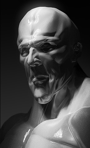
fig. 4.1 |
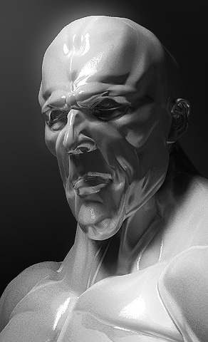
fig. 4.2 |
Figures 4.3
and 4.4 again show situations of light coming from top, but not
having any 'angelic' effect. The difference between figures 4.1
and 4.2, and 4.3 and 4.4 is that the latter have more localised
concentrated and harsh light spots. Such harsh and localised light
(along with harsh shadows) is adding to the negative side of this
character.
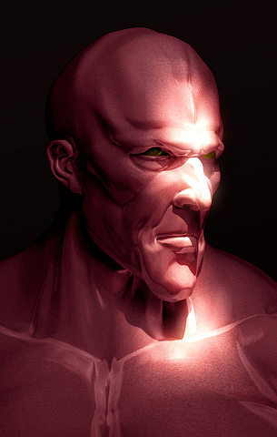
fig. 4.3 |

fig. 4.4 |
LIGHT
COLOR
I
stated earlier that the reason we are able to recognize the shape
of an object is because light rays of different intesities
hitting the object from different directions 'paint' the
object with highlights and shadows. To make this statement more
complete, I'd have to add here that our ability to recognize the
shape of an object depends upon the ability of light rays of different
intensities and different colors hitting the object from
different directions to 'paint' the object with highlights
and shadows.
The
color of incident light depends upon its source. White light is
composed of all the possible colors that exist. A ray of white light
changes color if it encounters an obstacle, which is not white and
is not black. If it hits a white object, the same ray is reflected.
If the object is black in color, the object absorbs all the light,
no matter what color it was originally, and nothing is reflected.
So basically when you look at a totally black object, you see the
color black because no light enters your eye from that direction.
To prove this point, I ask you to close your eyes for one second
(and please try not to doze off). Now...which color did we see?
In Fig. 4.5
below you can see a white incident ray of light, which is reflected
off a blue floor. The floor absorbs all the colors in the incident
ray except blue, and reflects it. Note that the light is reflected
at the same angle at which it was incident relative to the floor.
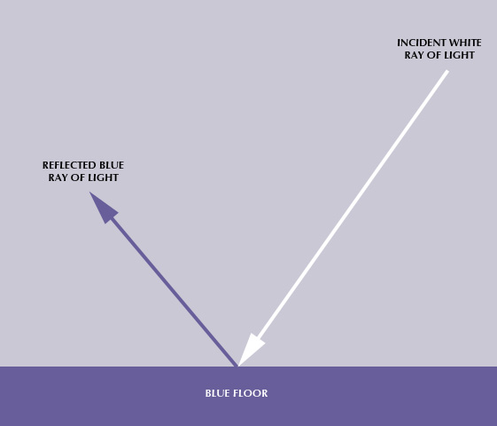
Fig.
4.5
Other things
being equal, any object that is in the path of this reflected blue
ray will be lit by blue light only. Furthermore, the ability for
a color to reflect light depends on its brightness and richness.
Bright red, for example, will bounce off more light than dark blue.
Different colors
also convey spatial and temporal relationships. OK. Lemme explain
what those fancy words are. A spatial relationship is based on the
distance (or space) between two or more objects. A temporal relationship
is based on time. (Ever heard the phrase "temporal displacement"
in Star Trek?)
The
color Blue is often used to represent depth. Just take a look at
any TV/film and all night time filming will have a slight blue tint.
An object lit with the darker (less saturated) shades of blue generally
has a tendency to stay in the background.
Generally
speaking, saturated colors represent close proximity, whereas unsaturated
represent distance. A good example to quote here is foggy/misty
mornings. As objects recede in to the distance, they tend to lose
their color saturation. To sum it up, brightly saturated colors
tend to stay in the foreground, and less saturated colors find their
place in the background.
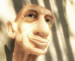
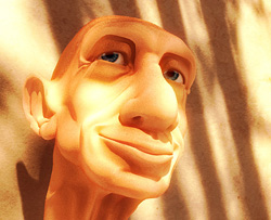
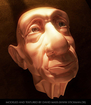
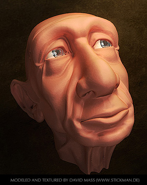
Take
a peek at the following three figures (5.1-5.3) of Gramps (modeled
and textured by David Maas).
All these images were tinted with different colors in Photoshop,
and each represents a different time of the day. Even though the
shadows don't change position through each of these three images,
a different point in time during the day is depicted by each.
Mornings usually
have a blue tint. Around mid-day, you get more or less even colored
light. There is some blue light present (reflected from the sky),
but its effect is not as much pronounced. Evening light is typically
characterized by warm, orange hues.
Gaze upon the
next set of three images. The shadows change positions in the first
two. Fig. 5.4 represents summer mid-day again, and 5.5 represents
evening time. Fig 5.6 depicts a scene lit by a moon high in the
sky. The blue tint is there to give the illusion of night time.
|
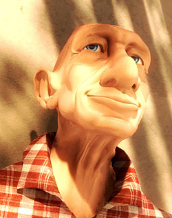
fig. 5.4
|
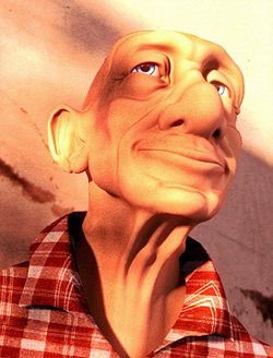 fig. 5.5
|
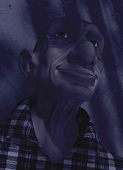
fig. 5.6